What Color Goes Well With Blue? 23 Powerful Pairings

Posted on August 8, 2023 | Updated on September 28, 2023
Figuring out what color to pair with blue can be challenging because there are so many variations. Subtle changes to tint, saturation, and brightness require different pairings. Take a look at these palettes to find out what color goes well with blue.
Why Use a Blue Color Palette?
Looking at different color combinations is helpful for determining what color goes well with blue because it has a massive number of shade variations. Many people favor it because it works well in most designs. In fact, it’s among the most popular website colors for its versatility alone.
It can create a sense of sadness, tranquility, or stability. Lighter shades reflect optimism and excitement, while darker ones typically are more solemn. Still, color associations vary widely depending on someone’s location and background.
For example, people in the United States feel red represents danger and excitement, while those in China think it stands for fortune and happiness. While many claim universal color psychology drives everyone to view a design similarly, culture affects everyone’s perception differently.
That said, some studies suggest it’s one of the few colors people view positively across cultures. Even though the exact feeling it invokes may not be the same for every viewer, it will still be good. If a design utilizes the color blue thoughtfully, it can be incredibly advantageous.
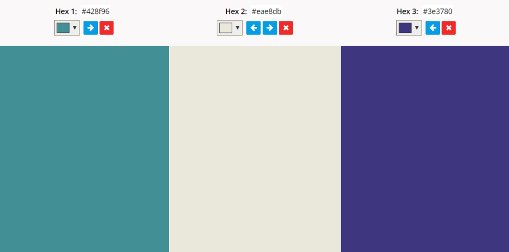
1. Slate Blue, Steel Blue, and Sage Green
Slate blue, steel blue, and sage green create a professional, muted palette. It creates a sense of stability and power because each color contains some gray. The connection of each makes it much more cohesive.
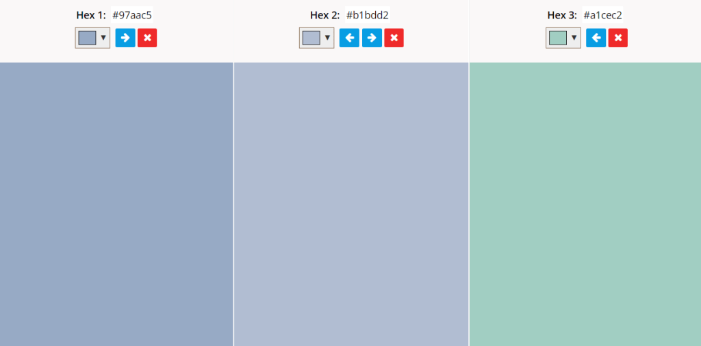
Both male and female customers mostly prefer shades of blue in advertisements because it invokes serenity, security, and trust. The subdued nature of this palette could strengthen those feelings because it emphasizes professionalism.
2. Turquoise, Crimson, and Eggshell
Turquoise blue, crimson, and eggshell combine powerful shades to create a bold palette. Blue typically goes well with red because they’re both primary colors. In this case, one is lighter and the other is darker to create balance.
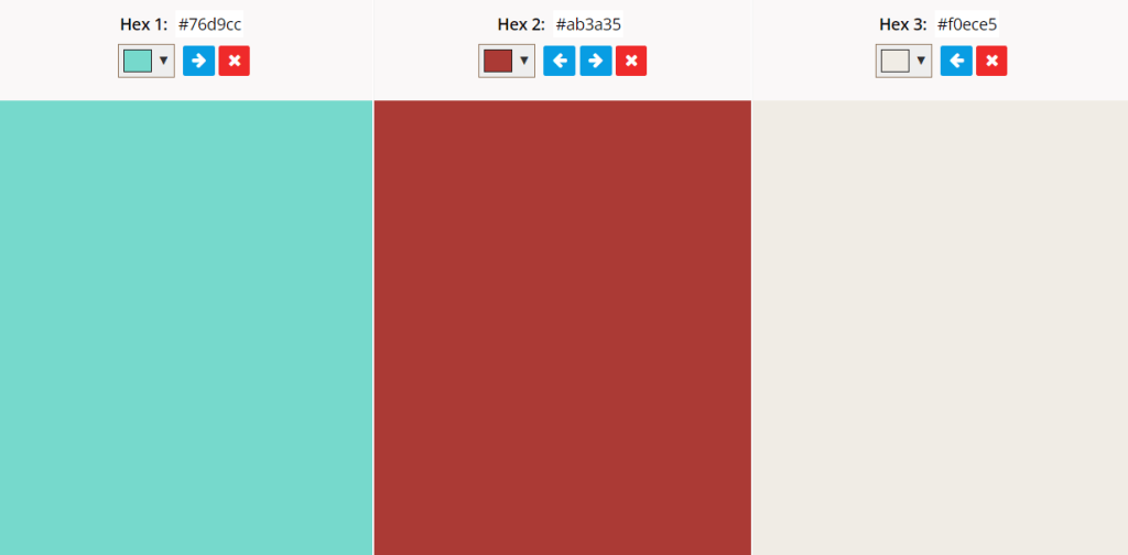
The combination of strong hues and an off-white neutral is ideal for establishing an unconscious association with the viewer. The two primary shades have strong emotional connections, so utilizing both in the same palette can create an interesting mixture of feelings.
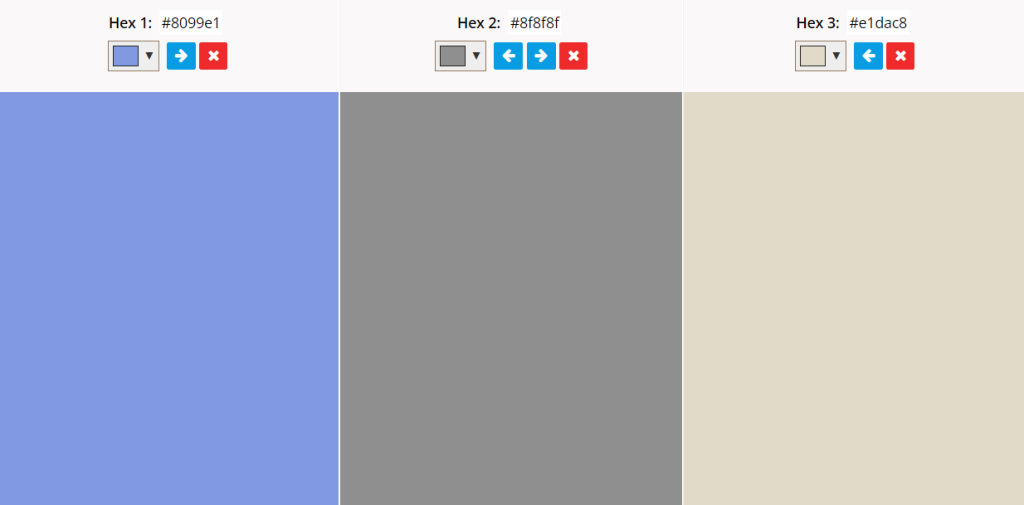
3. Classic Blue, Cream, and Off-White
Classic blue, cream, and off-white form a primarily neutral palette. The addition of a solid primary color offsets its lightness, making it helpful in calling attention to certain design elements.
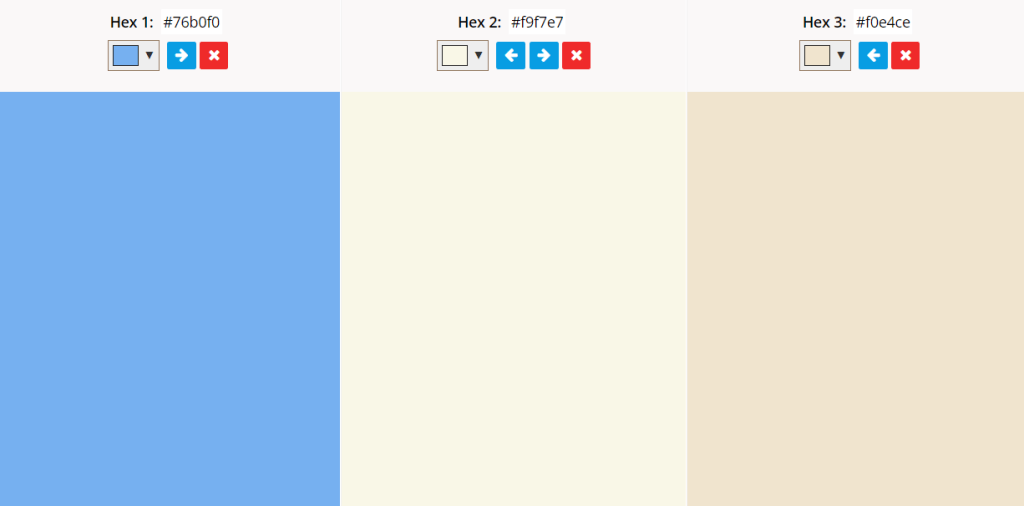
Realistically, any shade of blue would work just as well in combination with two variations of white. Still, the strength of the original has a unique appeal because it’s instantly recognizable. A robust, bold color makes for a much more exciting palette.
4. Robin’s Egg Blue, Olive Green, and Ivory
A robin’s egg blue, olive green, and ivory palette draws on the color’s environmental associations. It subconsciously ties a design to the sky, forest, and clouds, invoking a sense of natural tranquility. Shade variations work just as well as long as they balance each other. A lighter one may feel more open and positive, while a darker one suggests feelings of solitude and peace.
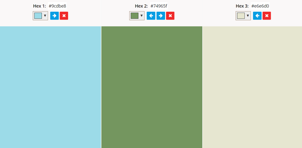
This palette is ideal for a design with organic elements or a connection to nature because it takes heavy influence from naturally occurring spectacles. For example, a brand marketing ethical, pesticide-free produce could use these colors to draw an unconscious association.
5. Sky Blue, Peach Orange, and Pale Yellow
Sky blue, peach orange, and pale yellow make a mellow palette. It works well because the colors are all soft and light, enhancing feelings of calmness and happiness. Also, it connects with natural elements.
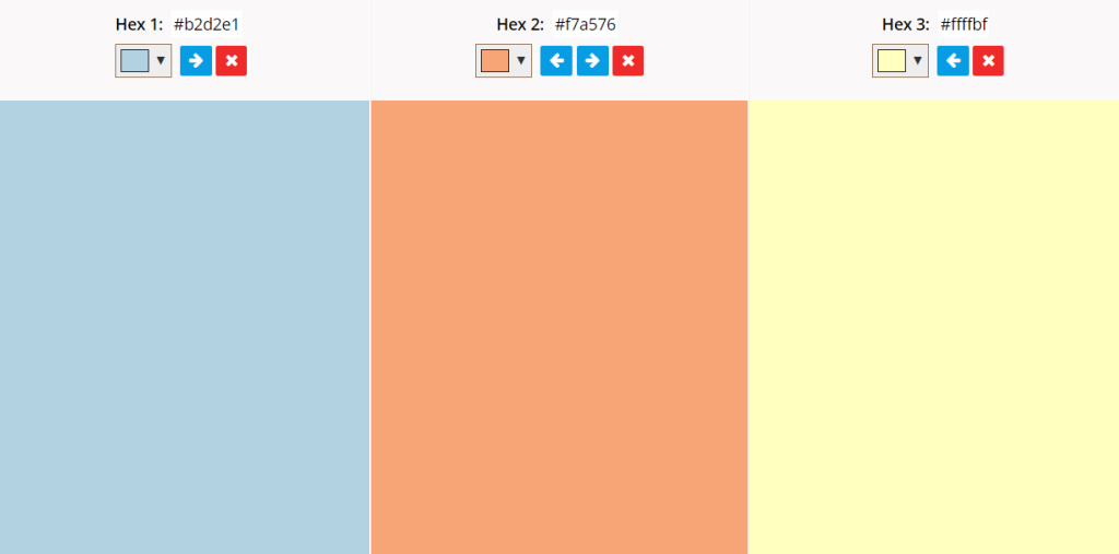
Since blue and orange are complementary, they’re instantly recognizable and draw attention. Even though these shades are much lighter than the usual pairing, they still pair nicely together. This palette is ideal for establishing an unconscious association with specific emotions.
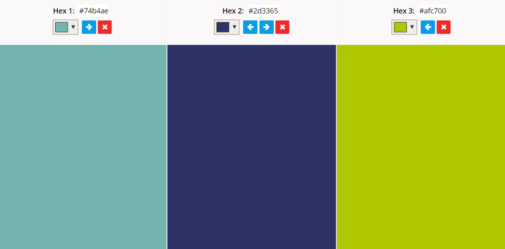
6. Mulberry Blue, Tangerine, and Chartreuse
Mulberry blue, tangerine red, and chartreuse are triadic. A triadic color palette utilizes one primary and two supporting hues for balance. Like blue-purple, yellow-green, and red-orange, they must be evenly spaced on the color wheel.
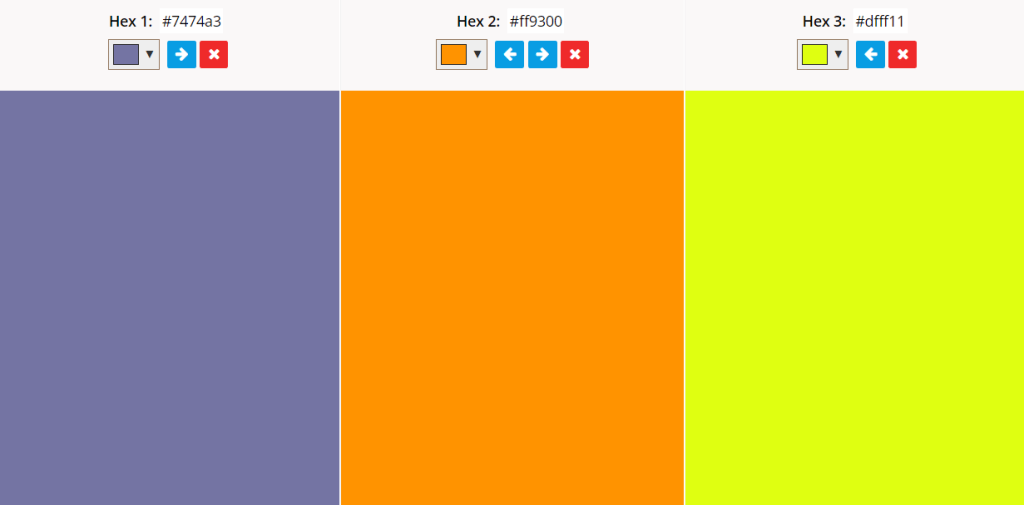
This palette’s cool, dark main color pairs well with the loudness of the two others, making it ideal for directing attention to critical points in a design. Also, the uniqueness of the shades makes it incredibly eye-catching.
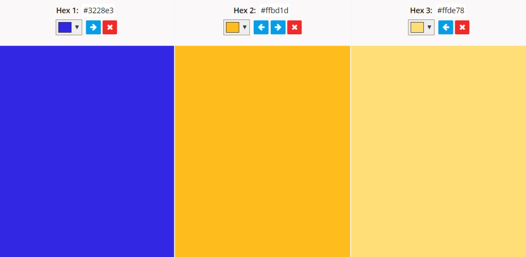
7. Navy Blue, Light Blue, and Bright Yellow
A navy blue, light blue, and bright yellow palette can emphasize certain parts of a design if there is a balance between each color. Since it mainly utilizes cool shades, the single warm one stands out much more. The strategic placement of each one could quickly draw a viewer’s eyes.
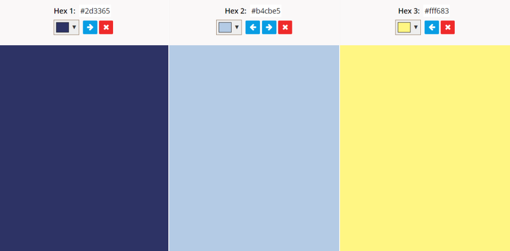
The palette works well because yellow is nearly the direct opposite of blue as one of the brightest, boldest colors. Since the first two shades are similar, it creates an attractive cohesion between them.
8. Vivid Blue, Bubblegum Pink, and Yellow
A vivid blue, bubblegum pink, and lemon yellow palette is bright and exciting. Bright pink may not be the first thing that comes to mind when wondering what color goes well with blue, but it works surprisingly well. Each color is loud and unnatural, making drawing a viewer’s eyes easier. Lighter shades are best, considering darker ones feel more muted and may not have the same appeal.
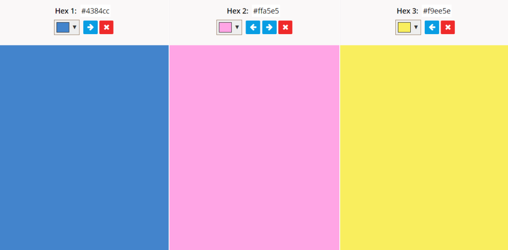
Pops of bright colors work well to hold attention, so this palette is useful for businesses wanting lighthearted product marketing. In print, the strategic placement of each would direct the viewer’s eye to key spots in the design. Since it’s a modern twist on a classic color, it may be useful for engaging a younger audience.
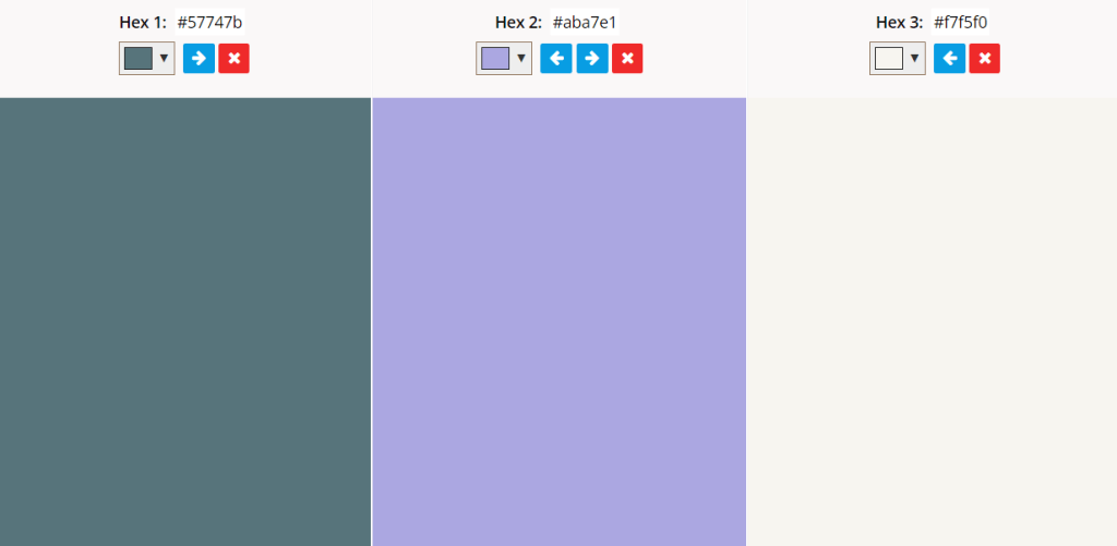
9. Seafoam Blue, Plum Purple, and Old Mauve
Seafoam blue, plum purple, and old mauve combine to form a cool palette. They look similar but stand out because they’re all mixtures of different colors. Various shades would work well because they blend easily.
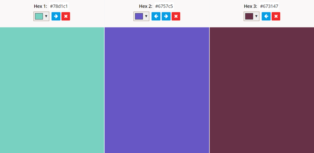
The more sophisticated purples balance the fun, casual blue to create a sense of relaxation or stability for the viewer. Since this palette is analogous, it enhances the unique aesthetic cohesion between the colors. It’s appealing to look at, so it is ideal for many different designs.
10. Navy Blue, Eggplant Purple, and Lavender
Navy blue, eggplant purple, and lavender make an aesthetically pleasing chromatic palette. It draws only on cool colors, relying on saturation variations to lead the viewers’ eyes somewhere. Also, it utilizes specific color associations, significantly enhancing the meaning of the design.
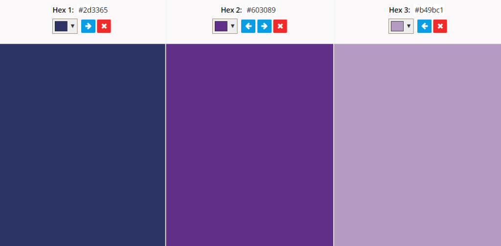
While these colors all connect to nature in some way, they will likely shift the viewer’s subconscious perception toward specific emotions rather than the environment. They’re cool and reserved, invoking a sense of calmness, serenity, or relaxation.
11. Royal Blue, Bright Orange, and Marigold Yellow
A royal blue, bright orange, and marigold yellow palette combines many bold colors. A cool temperature accent draws attention, so a design with small amounts of blue in strategic spots would catch the viewer’s eye.
These colors are very bright, so they work best against a neutral background. While they could stand alone, viewing them in a large design may be overwhelming. Strategic placement is ideal for creating emphasis.
12. Spruce Blue, Maple Brown, and Cream
Spruce blue, maple, and cream form a sophisticated palette. Every color is soft and natural, subconsciously reminding the viewer of the stability of nature. The neutral off-white and brown pair well with this shade of blue because they emphasize its saturation without making it feel overwhelming.
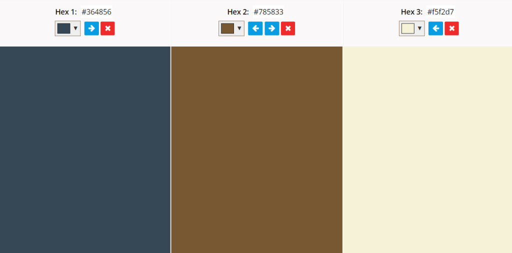
The palette is very subtle and relaxed, so it’s ideal for a professional design. Companies often use blue to invoke reliability and security, so it would work best for things relating to health, safety, or finance.
13. Dark Forest Blue, Salmon, and Pale Turquoise
The combination of dark forest blue, salmon, and pale turquoise gives off a playful aura. The bright, loud colors offset the moodiness of the darker base, making it feel enchanting.
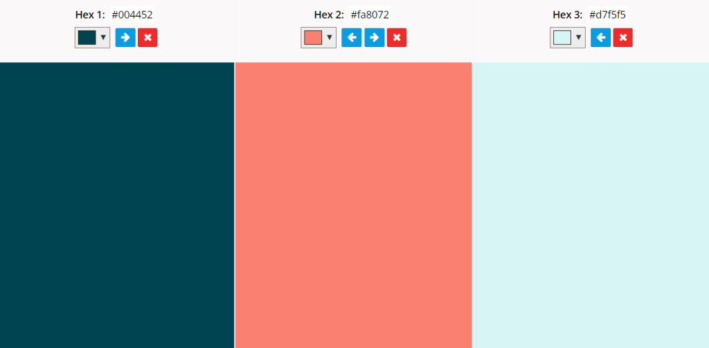
This palette is ideal for a background. With the darker shade as the base, small additions of the lighter colors stand out. While they may be overwhelming on their own — or even on a white base — dark forest blue mellows them somewhat.
14. Dark Aqua, Hot Pink, and Mustard Yellow
Dark aqua, hot pink, and mustard yellow are an extremely aesthetically pleasing pairing. Anyone wondering what color goes well with blue-green has their answer.
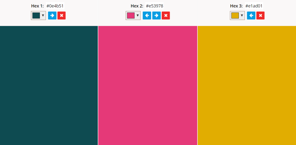
While each color is bold and intense, their varying shades make them easy to look at for extended periods. Hot pink is the brightest in this palette, so it would be ideal for directing viewers’ eyes.
15. Passionfruit Blue, Chartreuse Yellow, and Stormy Blue
A passionfruit blue, chartreuse yellow, and dark sky blue palette can easily emphasize print or digital work. The electric chartreuse yellow is like a neon bolt of lightning in an overcast night sky.
This palette is perfect for drawing attention and standing out. It’s an unusual combination, which makes it all the more interesting to look at. The bold contrasts invoke feelings of urgency, excitement, and amusement in the viewer.
16. Pale Royal Blue, Steel Gray, and Light Tan
Together, pale royal blue, dark grey, and light tan inspire feelings of serenity and stability. Since brown and gray work with almost every palette — and blue goes will with nearly any color — it’s an ideal pairing.
The professional, solemn tone of this palette would work well for financial, security, or cybersecurity businesses. These kinds of industries need consumers to associate them with trust and safety, so a pairing like this is ideal.
17. Blue Sage, Periwinkle, and Pure White
Blue sage, periwinkle, and pure white have strong ties to nature, cleanliness, and peace. They’re all bright colors, so they inspire positive, simple emotions in the viewer.
This palette is ideal for those who want nature or safety-centered creations. The shades are very mild, making viewers subconsciously associate the designs with peaceful, grounding emotions.
18. Powder Blue, Blush Pink, and Rasberry Pink
Powder blue, blush pink, and raspberry pink are light colors. They evoke feelings of happiness and calmness. When they’re together in a palette, a viewer would subconsciously associate all of their positive feelings with the design and brand.
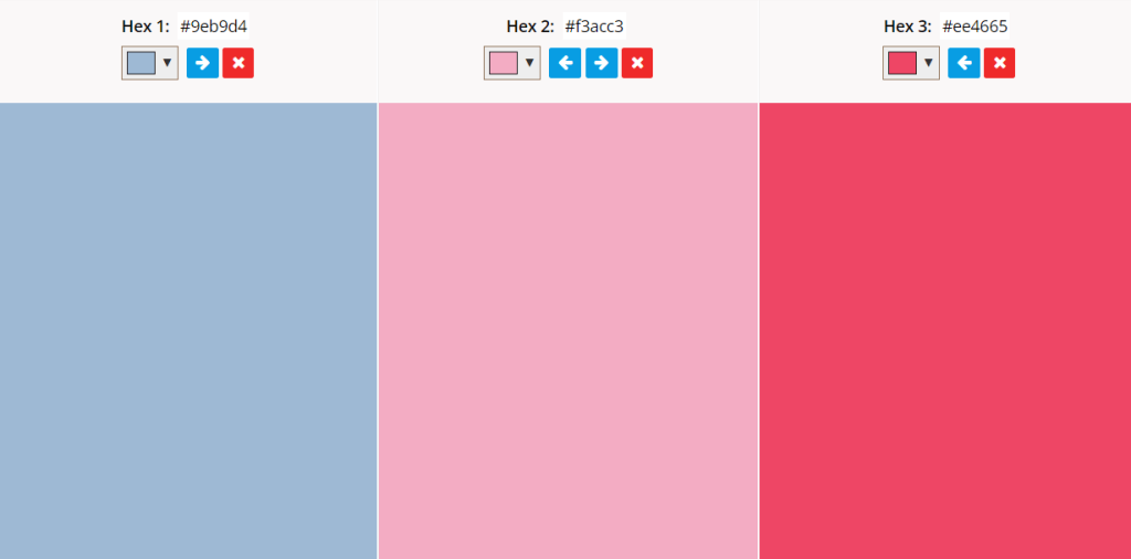
The lively, fun nature of this palette inspires emotions like joy and playfulness. Any family or youth-centric business would do well to use it. It’s an especially great choice for those catering to younger audiences because it has a slightly modern feel.
19. Aloe Blue, Navy Blue, and Dark Chartreuse
Aloe blue, navy blue, and dark chartreuse yellow have strong ties to green. Because of this, they work well together. They’re also all mild and moody, so they inspire similar subconscious connections in the viewer.
The strong emotional connection this palette creates is useful for highly professional or modern businesses. It isn’t immediately eye-catching and is very mellow, so they can use it throughout a design without it being overwhelming.
20. Lagoon Blue, Alabaster, and Blackberry Blue
The lagoon blue, alabaster, and blackberry blue pairing mainly consist of blue shades with a neutral base, creating a monochromatic-adjacent palette. It’s useful for any aesthetic design.
This isn’t a particularly eye-catching palette, but it’s extremely aesthetically pleasing. Instead of using it to direct attention, businesses can use it to invoke emotions and enhance a design’s cohesive qualities.
21. Pale Sky, Sunrise Yellow, and Rust Red
Pale sky blue, sunrise yellow, and rust red are reminiscent of a dawning day. This palette works well because the colors each have ties to nature, enhancing their connection to each other.
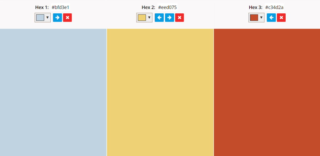
This combination invokes a natural tranquility, so it’s best used in designs meant to convey peace, understanding, or serenity. For example, a plastic surgery business could use it in marketing material to put prospective patients’ minds at ease.
22. Deep Navy Blue, Pale Apricot, and Dark Mustard Brown
A dark navy blue, pale apricot, and dark mustard brown palette balances deep shades with lighter ones. This connection makes a design feel more grounded and stable. The earthy tones of each color would add a professional feel to a design.
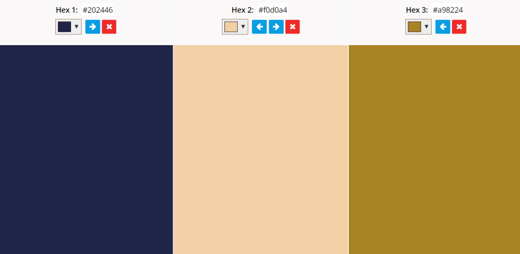
The combination feels entirely classic at first, but pale apricot gives it a noticeable modern twist. Dark navy and orange are complementary colors, so they mesh incredibly well together. The addition of a neutral shade tinged with yellow brings each color together.
23. Blueberry, Dusty Lavender, and Wine Purple
Blueberry, dusty lavender, and wine purple make for an interesting color palette. While every shade is cool, there are also warm influences throughout. While each has a clear connection, the blueberry shade stands out. It would be a good attention-catching color.

The appealing aesthetic of this combination is ideal for marketing and sales. After all, around 93% of consumers decide to buy something based on its color alone. The pleasing visuals will surely influence their buying behaviors.
Blue Goes With Everything
What color goes well with blue? It works with warm, cool, and neutral colors, making it one of the most versatile shades. Still, its meaning and emotional connection change depending on its saturation and tint. It’s necessary to strategically pick its pairings to create a functional design.