The Psychology of Typography

Posted on September 7, 2022 | Updated on September 7, 2022
Fonts are everywhere you look. You see them in magazines, websites, products and various advertisements. Yet one thing people don’t typically notice is the psychology of typography.
The psychological meaning behind a font is what makes it successful because the font you choose represents your branding. Therefore, you can use typography to connect with your audience on an emotional level through its aesthetics.
Fonts have a powerful way of evoking a certain emotion, which is especially important in this digital age.
Here, we’ll take a closer look at the psychology of typography and the different meanings behind each style.
What Is the Psychology of Typography?
One theory behind the psychology of typography is how people perceive fonts and what emotions are associated with them. When you see a font, you might connect its physical traits with your thoughts and feelings.
For example, if you saw a wellness brand about health and nutrition, you might see a thin, light and simple font. That way, you associate their brand with wellness.
The Shapes and Colors of Fonts
It’s also worth noting the psychological aspects of font shapes and colors. Regarding a font’s shape, you’d be looking at its geometric form and what emotions it elicits in the viewer.
Shapes impact fonts because they have geometric elements that play a role in the viewer’s feelings.
For example, a font could be sharp, indicating modernness, agility or seriousness. Meanwhile, a roundedness can create a soothing feeling.
Color also plays an important role in evoking different emotions. Different hues and shades can create a certain mood you want your brand to embody.
Essentially, it’s important to understand the psychology of typography because it can influence the audience’s perception of who you’re targeting.
The Different Fonts and Their Meaning
Fonts come in six different styles, equipping various characteristics. Here are the differences between each of them and what they communicate.
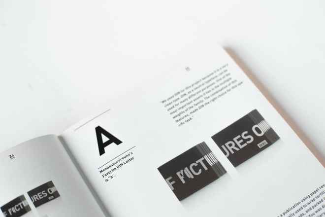
1. Serif
Serif fonts are the most traditional typographies out there. Often, people perceive this font as trustworthy, credible and formal. Most industries that use this type of font are law firms or financial institutions because they want to inspire feelings of authority, trust and respect.
The most popular serifs you can try are Times New Roman, Garamond and Georgia.
2. Slab Serif
Slab serif fonts are part of the serif font family. They look similar to serifs but are often bold and chunky-looking.
Still, they have the same traditional look and are distinctive. Slab serif fonts are perfect for businesses that sell innovative products and want to convey high energy.
3. Sans Serif
Sans serif fonts embody a minimal and engaging look. Often, they can feel serious but openly progressive. Brands that choose this font may consider themselves trendy and forward-thinkers. The classic examples include Arial, Helvetica and Century Gothic.
4. Script
Many brands use script fonts to portray themselves as feminine and elegant. Often, they provoke creativity and give off a whimsical feeling.
Script fonts mostly come in the form of fancy handwriting, delighting the viewer in an artsy way. However, you should use this font with caution. Too much of it can leave your text illegible and confusing to a reader.
The most popular script fonts you may see today are Lucida, Zapfino and Lobster.
5. Modern
Modern fonts present a futuristic look. They combine a playful but practical display and can transition between thick and thin strokes.
Modern fonts display a sense of intellect and exclusivity. They particularly attract the millennial generation, and it’s a great way to modernize your brand.
Some popular forms of modern typography include Politica, Klavika and Matchbook.
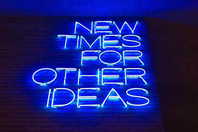
6. Display
Brands typically use display fonts for larger mediums like billboards, book covers and headings. They can be any serif font or have a unique style. However you use these fonts, you can solely use them to be eye-catching.
In general, display fonts can be fun, casual and exude personality. These fonts are ideal for any business, and some examples of typography include Gigi, Bombing and Jokerman.
Apply the Psychology of Typography to Your Brand’s Look
Now that you know the psychological meaning behind the different fonts, it’s time to put it to the test. When creating your brand identity, choose a font that resonates most with your audience.
Remember, not all designs evoke the same feeling. However, the font you choose can strengthen your message and influence your audience. Therefore, you can use them to your advantage once you start designing.