How to Select the Best Fonts for a Header

Posted on August 9, 2023 | Updated on September 25, 2023
Your website design is often the first impression potential clients have of your business. Finding the best font for a header shows your personality as a brand but is readable and builds trust is a big hill to climb. The best fonts for headers may have been used so many times you feel they are overdone and you want something a bit different.
Thankfully, we’ve done a lot of the research for you over the years, stayed up-to-date on new releases and trends and have a lot of ideas about which fonts work well for headers and how to pair different ones for an engaging look that draws readers in.
We’ve included the best fonts for headers that you likely have seen and heard of many times. However, we also added some new ones you may not know. Our favorite fonts to use in website headers, but that also work in headers for social media and emails, include the following:
1. Arial
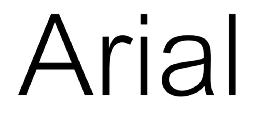
In a previous study by Smashing Magazine, researchers found 80% of sites they studied used one of the first three fonts we’ll list here. These fonts come preinstalled with programs such as Adobe, Canva and Microsoft Suite. Another 20% used Helvetica as an alternative.
Arial and the other two fonts are also highly readable at various sizes. Arial is defined as a neo-grotesque sans serif typeface. Robin Nicholas and Patricia Saunders designed the font. Arial released in 1982 through Monotype. Many pointed to the similarities to Helvetica.
The curves of the letters are soft but structured. End strokes are diagonal, which creates a less computerized look than some other sans serif fonts. Arial is often used in presentations, magazines and newspapers. It scales up or down equally well. It’s a perfect basic font for header text, including menu lettering.
2. Georgia
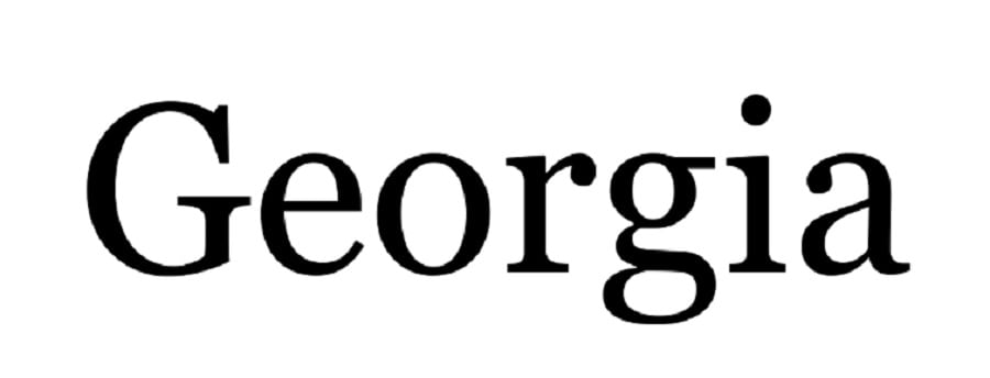
We’d be remiss if we didn’t include Georgia in our list of best fonts for headers. The font comes pre-packaged with many programs.
Georgia is a serif font that looks a bit formal. The font was initially compatible with Windows and Mac computers, creating a sort of cult following amongst designers.
The font works well for bank websites, luxury products and wedding services. Depending on your clientele, photographers might also benefit from using Georgia in their headers.
Variations of the strokes on various portions of letters give the font some definition that has an almost calligraphic look. Some of the letters blend into one another for continuity. You might also notice the lowercase letters have a tall x-height, filling space and giving the font a unique appearance.
3. Verdana

Verdana is called a humanist sans serif font. Matthew Carter and Thomas Rickner joined forces to create the beautiful structure for Microsoft.
Pixel patterns create a hand-crafted look to ensure users don’t confuse some of the letters that look similar to one another in lowercase, such as “i,” “l” and the number one. If you work with the font frequently, you likely realize the dot over the letter “i” is square. Such minute details avoid reader confusion and improve comprehension. However, the font can present some kerning challenges thanks to some letters being sider than others.
Verdana is frequently used for headlines. You may need to work a bit longer to get the spacing figured out, but the end result will be an elegant and eye-catching headline for your site.
4. Helvetica
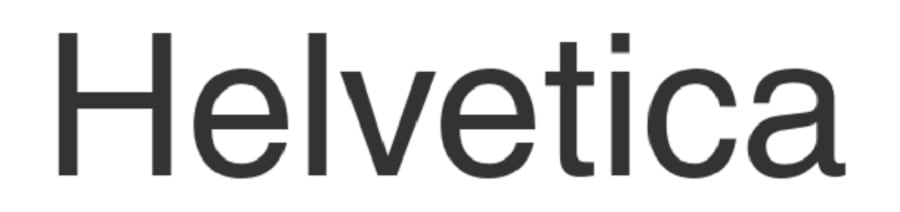
Another font commonly listed in groupings of best fonts for headers is Helvetica. We wanted to include it because it’s like an old friend you don’t just abandon as new things come into your life. This will be the last of our popular fonts. The rest will focus on lesser known options.
Eduard Hoffmann and Max Miedinger designed Helvetica in 1957 in Switzerland. It is another neo-grotesque sans serif typeface.
The font’s design is meant to be neutral and not evoke emotions in the reader. Helvetica is frequently used by designers and large corporations. Terminations are either vertical or horizontal without the slants of some other san serifs. Fortunately, the font is easily adaptable to both Windows and Mac operating systems and translates well on all screen sizes.
5. Isadora
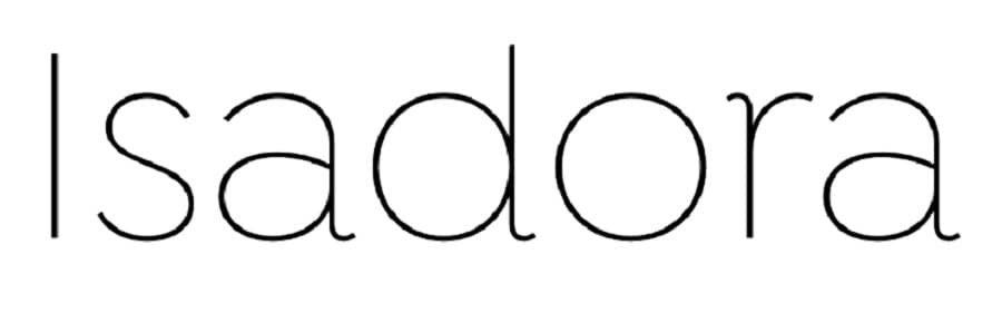
If you’re seeking something a bit thinner and less formal looking, Isadora is a fun font you can utilize in your headers. It comes in a variety of weights, so select the one that looks the best with your background and other elements.
Pictured above is Isadora Light, which features thin lines and slight serifs on some terminations. Note how swoopy and perfect the lowercase “a” is. The typeface reminds one of beautiful handwritten notes or informal invitations to parties.
6. Prossima Moda
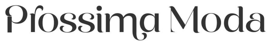
If you really want to use a script but you know it won’t translate well on mobile devices, try something like this font for your website header. It is a newer font but quite unique in its ligatures and terminations.
Prossima Moda is a modern display font that speaks to sophistication and informality at the same time. The contrast within the font gives it some mystery so the reader is never sure what the next character might do.
It hints at an air of romance, which would make it perfect for wedding websites, dating apps and romance novel covers.
How to Pair Best Fonts for Headers
Although you might be tempted to get fancy and add in some decorative or script fonts, proceed with caution when designing for the web. If someone accesses your site on a mobile device, will the text still be readable at smaller sizes or will letters become skewed and challenging to read?
Research shows around 383.4 million cellular connections in the United States in 2023. Between 2022 and 2023, the number of active mobile devices grew by 113.1%. It’s quite likely many of your users visit your site via a smaller screen than a desktop. Make sure your headers are readable no matter what method consumers use to access your pages.
Create Your Own Style — The Best Font for a Header
The best fonts for headers are the ones that speak to your personality as a brand. While the list above is an excellent starting point, seek out new fonts and established ones and try different combinations until you hit on the most aesthetically pleasing but functional design possible.