Figuring out the typography for a website or design project isn’t always easy. Should you use serif with sans-serif fonts? What are the best font pairings that mesh well?
There are four basic types of fonts, but many variations within those categories. Choose from serif, sans-serif, script or decorative. How to mix different fonts depends a bit on your type hierarchy.
Using a sans serif for your body and a serif for your headings, and vice versa, creates some interest. Adding a decorative font to your log and sticking with a more basic font for more readability is also a nice combination.
To keep things simple for you, we’ve come up with 10 fonts working well together and suggestions for alternatives. Study these and even come up with a few of your own.
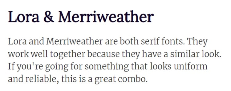
1. Lora & Merriweather
Source: all font pair screenshots taken from https://fontpair.co
Lora is a Google font with a modern serif based on basic calligraphy styles. Designed by Cyreal, it was created for digital use, but scales for print as well. It features brushed curves and serifs with swooshes and curls. Lora also pairs with Lato, Raleway and Montserrat.
Merriweather is a Sorkin Type design and also a Google font. The purpose of creating this font was for use as body text on screens. The x-height is tall with condensed letters and a slight tilt to the right. The serifs are reminiscent of newspaper type. Merriweather also pairs with Open Sans, Roboto and Montserrat.
Lora and Merriweather are both serif fonts. They work well together because they have a similar look. If you’re going for something looking uniform and reliable, this is a great combo.
2. Libre Franklin & Libre Baskerville
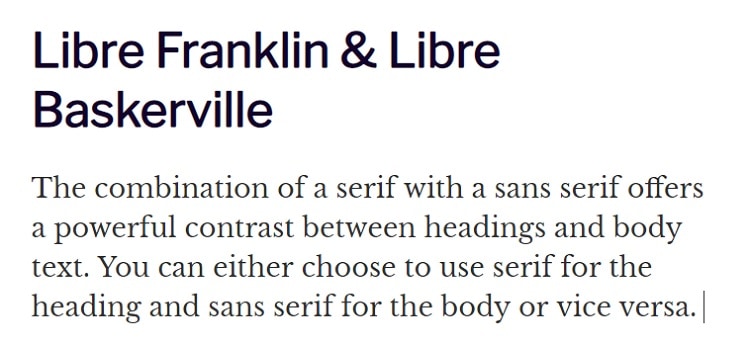
Libre Franklin is an Impallari Type sans serif font. It is available via Open Font License (FL) for collaboration and modification as needed. The inspiration for the typeface came from the 1912 Morris Fuller Benton Franklin Gothic font. The design has simple lines without any additional serif adornments.
On the opposite end of the spectrum, Libre Baskerville is a serif font with some tilted serifs and some round. Also by Impallari Type, this font is based on the American Type Founder’s 1941 Baskerville. It does have a taller x-height than Baskerville and some other adjustments to make it more readable on digital devices.
The combination of a serif with a sans serif offers a powerful contrast between headings and body text. You can choose to use serif for the title and sans serif for the body or vice versa.
3. Abril Fatface & Droid Sans
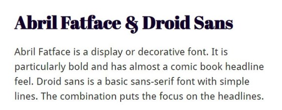
Abril Fatface is an open source decorative font created by TypeTogether. It’s a mix of serifs, sans-serif, swirls and a wide y-base structure. This font works perfectly for logos or headlines. The style is a modern version of Didone styles and captures reader attention. Abril Fatface also pairs with Oswald, Lato and Raleway.
Droid Sans is a simple sans serif typeface. Droids Sans falls into the category of a humanist typeface. The simple lines make it perfect for body text, particularly on digital screens. In addition to the pairing listed above, you can use Droid Sans with Pathway Gothic One, Amatic SC and Droid Serif.
Abril Fatface is a display or decorative font. It is particularly bold and has almost a comic book headline feel. Droid sans is a basic sans-serif font with simple lines. The combination puts the focus on the headlines.
4. Dancing Script & Ledger
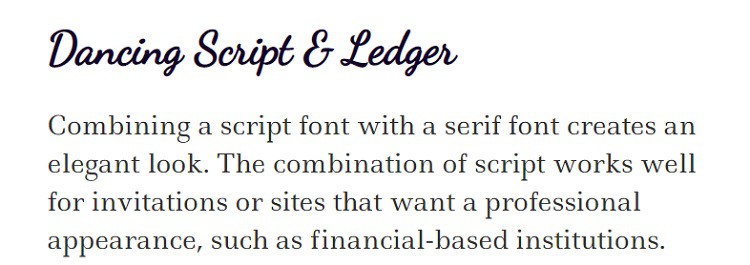
Scripts rarely work well for body text, but can be used in logos and headings with great advantage. They can add a fun or elegant tone to any design.
We use Dancing Script as the headline in the screenshot above and Ledger for the body text. Notice how the two add contrast drawing the eye back and forth between the different text blocks. Although it is a script font, it’s still casual enough for most modern use, while still lending some elegance to your design.
Impallari Type created the font with inspiration from Murray Hill and the bouncing effect created by varying weight distribution throughout the letters.
Ledger is a basic serif font designed by Denis Masharov. It has an exact layout with a large x-height and wedge-shaped serifs. The font’s purpose is to create readable text on screens, making it the perfect addition to any website body text. It also translates well in print because of the tallness of the letters.
Combining a script font with a serif font creates an elegant look. The combination of script works well for invitations or sites wanting a professional appearance, such as financial-based institutions.
5. BioRhyme & Space Mono
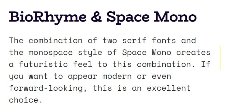
BioRhyme is from a Latin typeface family. It comes in two widths, a regular and one that is expanded and broader. There are also five weights in each family, making it suitable for medium to large sizes. BioRhyme works best for headings. Designed by Aoife Mooney, the serif font is one of her first published creations. The font also pairs well with Montserrat, Crimson Text and Eczar.
Space Mono falls firmly into serif territory. It has a fixed pitch and width, utilizing regular, italic and bold for a non-proportional look. Designed by Colophon Foundry, it was meant for use in headlines or display type. The font has a geometric foundation and is closest in style to grotesque typefaces from the 1960s. You’ll often see similar types in science fiction titles. The font also pairs with Poppins, Libre Baskerville and Roboto Slab.
The combination of two serif fonts and the monospace style of Space Mono creates a futuristic feel to this combination. If you want to appear modern or even forward-looking, this is an excellent choice.
Making Your Own Font Pairings
If the ten fonts above and how we’ve combined them into beautiful pairings inspired you, try some of your own mixes. Consider the two types of fonts you’d like to connect and test them in sample text to see how they look. With a little practice, you’ll find the style and mood you’re looking for and push visitors through your pages while engaging them on a subconscious level.