Creating a Memorable Identity for Your Business with Color Contrast and Branding

Posted on July 18, 2023 | Updated on July 18, 2023
As a graphic designer, you know that color plays a larger role than making an image look pretty. Rather, it’s how you communicate your work and connect with your audience. Yet, color contrast is one of the most powerful tools in your palette. Utilizing contrast in design is an excellent way to separate one creation from another, adding depth and guiding viewers to a certain feature of the design.
Whether you’re an experienced designer or just getting started, here are some helpful tips to take your designs from good to breathtakingly eye-catching.
The Importance of Color Contrast in Graphic Design
Color contrast plays a vital role in shaping the visual hierarchy of your designs. Think of it as a spotlight, illuminating the important elements and ensuring they pop out from the backdrop.
With color contrast, you can skillfully guide a viewer’s attention to key components, from the title to striking visuals — creating a clear and engaging narrative flow within your design. It’s no wonder then that, according to research, as much as 90% of a viewer’s impression of a product or environment relies mainly on color.
However, the magic of color contrast doesn’t stop there. It wields a powerful impact on the mood, tone and overall message of the design. Different color contrasts can evoke various feelings and responses.
For instance, bold, high-contrast combinations may stir excitement or urgency, perfect for call-to-action buttons or promotional designs. On the other hand, softer contrasts convey calm, subtlety or sophistication. When mastering color contrast, you can stir emotions and build an atmosphere that resonates with your audience — all while reinforcing your design’s message.
Every color contrast choice you make shapes the overall viewer’s experience. By understanding and implementing these principles, you can ensure your designs are eye-catching and heart-touching.
Tips to Leverage Color Contrast in Your Design
When leveraging color contrast in your designs, consider incorporating these tips for more effective outcomes.
1. Choosing Contrasting Colors
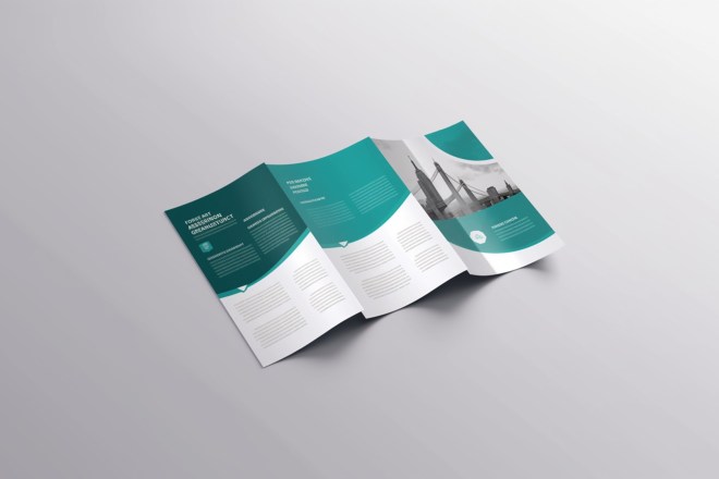
Choosing the right contrasting colors is a cornerstone in compelling design, and the color wheel is an essential guide in this process. For instance, take complementary colors — they sit opposite each other on the wheel and provide a high degree of contrast. A classic example is red and green.
Consider your design’s message while selecting colors. Suppose you’re designing a poster for a music festival — warm colors like red and orange would be an ideal choice. They’re vibrant, energetic and attract attention — reflecting the lively spirit of the event.
On the flip side, cooler colors like blue and green would serve better if you’re working on a health care company’s logo. They exude calmness and reliability, resonating with the firm’s promise of trusted care.
Lastly, contrasting colors bring dynamic energy to your designs, ensuring they stand out and command attention. For example, a bright yellow call-to-action button on a deep purple background can’t help but be noticed.
Overall, your choices shape the perception of your designs, making them truly memorable.
2. Balancing Color Contrast
Balancing color contrast is a delicate dance in design. While high contrast is great for making your designs pop, overdoing it can lead to visual chaos and overwhelm viewers. Therefore, finding the right balance is key to creating a layout that is compelling yet easy on the eyes.
The first step to balancing the two is to pick one dominant color and use contrasting colors to highlight important elements. For instance, if you have a dominant deep navy background, you could use a vibrant coral for your call-to-action button to ensure it stands out but keep other elements subtly contrasted.
Harmony is just as important as contrast. A well-considered color scheme marries the two, creating a visually pleasing yet intriguing design. Keep experimenting and adjusting until you hit that sweet spot of balanced contrast.
3. Applying Contrast to Different Elements
Color contrast goes beyond the overall color scheme — you can also apply individual design elements to create engaging visuals. Consider typography, for instance. Contrast between text and background can enhance readability and make your message clear. A light font on a dark background or vice versa can make your words pop.
Think about shapes, too. Contrast can accentuate different components, like a vibrant logo on a muted backdrop. It can create depths, add a 3D effect to a 2D design or guide the viewer’s eye in a particular direction.
Varying the level of contrast between different elements prioritizes information. A high level of contrast draws attention, while low contrast provides visual rest or background context. The art of contrast can transform your design from static to dynamic, engaging viewers on a deeper level.
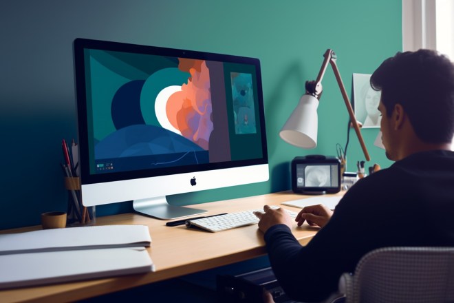
4. Use of Tools and Software
Graphic designers are always on a quest to look for the perfect color combination. When it comes to color contrast, you have a range of tools and software at your disposal. These tools can help you create and visualize color contrast when you find it challenging to do this alone.
Color-picking tools, like Adobe Color and Coolors, can assist you in generating a nice blend of color palettes. Gradient generators, such as CSS Gradient and Canva, help you visualize how different colors interact and transition.
Furthermore, advanced design software like Adobe Illustrator or Sketch offer features that allow you to manipulate color contrast in a granular way, fine-tuning your designs for maximum impact.
We highly recommend you leverage these tools to save time, enhance accuracy and unleash creativity. That way, you can master the use of color more effectively.
5. Experimentation and Testing
In graphic design, the path to perfection often lies in experimentation and testing. Trying out different color combinations and contrast levels is crucial to discovering what works best for your specific design.
With experimentation in mind, consider playing with shades, tints and tones, and observe how they interact with one another. See how altering contrast can dramatically change the mood and focus of your design. Sometimes, a slight tweak in hue or saturation can make a world of difference.
Moreover, seek constructive feedback, as you can get a treasure trove of insight from colleagues, friends and even your target audience. Gaining input from various people can provide fresh perspectives you may have never considered.
Unleashing the Power of Color Contrast
Mastering color contrast is key to striking visual and effective designs. Yet, keep in mind that it’s more than aesthetics — it’s a tool to create a visual hierarchy, guide the viewer’s eye, and convey the right mood and message. From picking the perfect colors to achieving the right balance, the possibilities are endless.
Harness the power of digital tools to aid your process, but most importantly, always keep experimenting. Every design is a new canvas to explore the use of colors in exciting ways. With each design, you can create beautiful visuals while connecting with your audience on a deeper level.
About The Author

Eleanor Hecks is the Editor-in-Chief of Designerly Magazine, an online publication dedicated to providing in-depth content from the design and marketing industries. When she's not designing or writing code, you can find her re-reading the Harry Potter series, burning calories at a local Zumba class, or hanging out with her dogs, Bear and Lucy.