


IoT
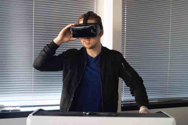
The Internet of Things (IoT) is a collection of interconnected devices all tapping into the power of a collective cloud. A smart city might utilize the IoT to track different systems, such as a subway or electrical grid. A homeowner adds their security system to Wi-Fi and uploads real-time video for future reference.
The applications for IoT are almost limitless and impact both personal and business endeavors. Society has more information at its fingertips than at any other time in history. The highlight of IoT is being able to tap into big data in mere seconds, process the details and spit out a report that can be used to improve things.
Why is IoT Growing So Rapidly?
By 2025, there will be around 39.9 billion connected IoT devices globally. Experts stepped up the numbers after the pandemic. More people started working from home, requiring individuals and companies to tap into the power of big data sooner than anyone expected.
As new products hit the market, people want smart everything. Smart watches, doorbells and even refrigerators. Expect IoT to hit record highs in the next few years.
Another reason for such rapid growth has to do with older generations embracing technology no one thought they would. Grandma is on Facebook. Great-Aunt Matilda uses a smart front door lock. The younger generation is so comfortable with tech that they don’t think twice about using it.
Nearly everyone has something connected to the IoT. As high-speed internet becomes available in rural areas, it also increases the number of people able to tap into the world wide web.
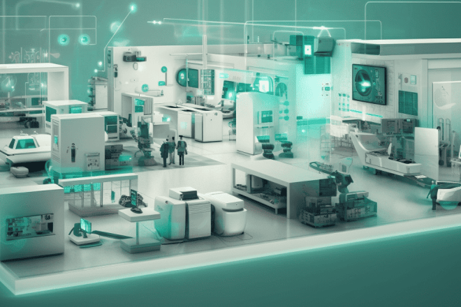
IoT for Business
Here at Designerly, we look at how IoT impacts business and designers in positive ways. However, there are a few pitfalls as with any endeavor. Being aware of what the drawbacks are helps you avoid them and embrace only the helpful aspects of the technology.
Learn what tools individual industries can utilize to scale up. No matter what type of business you own or even if you are a solopreneur, you can find some type of device to improve operations.