Top 6 Best Website Navigation Examples

Posted on July 30, 2023 | Updated on July 30, 2023
One of the most crucial components of a strong user-friendly web design is the navigational hierarchy and structure. Users want to find the point of reference quickly and rely on it to be in the same place throughout a site. The best way to learn how to create a fabulous system is to check out top website navigation examples.
1. We3

We3 is a great place to start when looking at best website navigation examples. The simplistic nature of the navigation on this site puts the focus on the next step for users. The purpose of the app is to help people find new friends in your area, so the first of two options in the navbar is “Find Friends in My City.”
You can repeat the success of the above website by narrowing down the categories for your site. What action do you want users to take? Place it early in the navigational hierarchy.
Ideally, limit the number of options to around five. If you find you have too many categories, see which ones might easily combine and add subcategories. You can add additional options via a drop down or a separate page.
2. Bad Ass Coffee
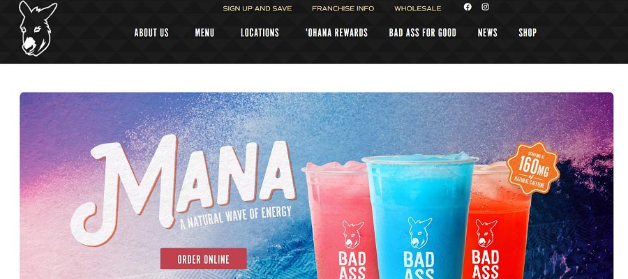
Bad Ass Coffee adds their donkey logo to their navigation. Using a simple outline keeps it from detracting from the purpose of the bar, while still imprinting their branding on the site. They also keep a bit of space between the logo and the links to set it off a bit.
The logo serves as a link to the homepage. Most users expect clicking on a logo to take them back to the home of a site, so adding this minor detail scales up your design.
As with many of the other logo examples in this article, you’ll see the number of overall categories is small.
3. The Daily Egg

Crazy Egg has a blog called The Daily Egg. By adding a call to action (CTA) button directly into the header, they put the focus on converting site visitors into leads. Users can move around the site and select from categories such as Reviews, Marketing or Social Media. However, the focus goes to the “Free 30-Day Trial” button outlined in blue. The CTA is also larger than the other navigation elements in the header.
When looking at website navigation examples, check out how other sites add a CTA to the mix. Some place it above the fold. Others add information and place it near the bottom of the page. You should always test button placement and see which location, size, colors and text your target audience responds best to.
Utilize both split testing and multivariate testing to figure out what works best for your customers. You can also survey your customers to see what they prefer. The more customized your navigation is to your customers, the more effective it will be.
4. Zappos
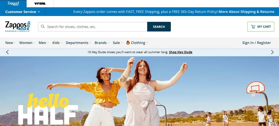
Zappos has a more complex navigation structure than some of the other sites we’ve looked at so far. They have a couple of brand tabs directly at the top of the website. They also highlight the typical categories you’d expect to see on a shoe retailer site, such as Women, Men, Kids and Sale.
What stands out on the Zappos site is their search feature. Because they have massive inventory, adding a search feature allows visitors to go directly to the results they need without moving through multiple levels.
Consider whether you have enough inventory to warrant adding search functionality to your site. If you do want to add it, do you want a small magnifying glass icon and a drop down search bar? Perhaps you want a larger search feature to grab attention, such as the one Zappos utilizes on their home page.
5. Franklin Sports
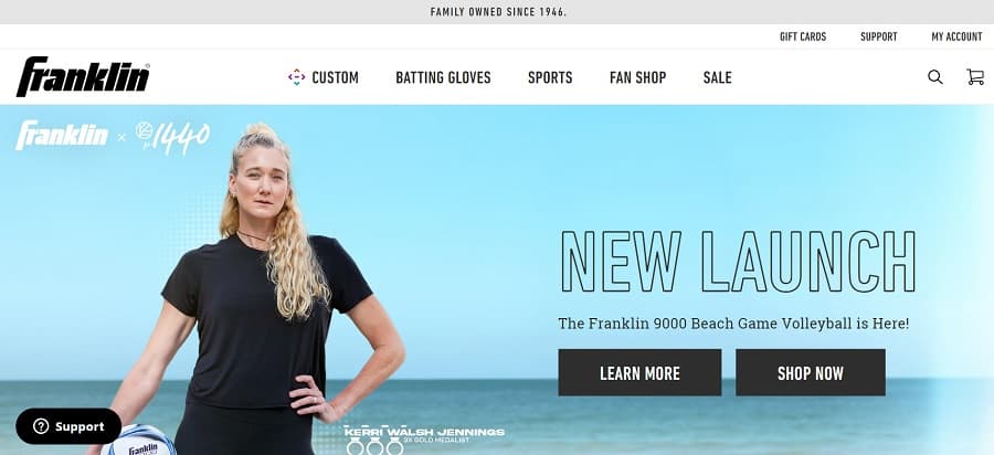
We love the clean, crisp layout for Franklin Sports. This website navigation sample is something worth studying, because it offers more than just a nav bar. You’ll also find CTA buttons on top of the hero image for “Learn More” and “Shop Now.” You can even navigate to a support page without ever going below the fold.
The primary navigation bar offers five basic categories, a linked logo, a search feature and a shopping cart shortcut. The smaller icons serve as a placeholder without distracting from the message of the page.
Keep in mind that your navigational hierarchy doesn’t end with a bar in the header. You can also utilize CTAs, the footer and links within the body text.
6. Stephen King
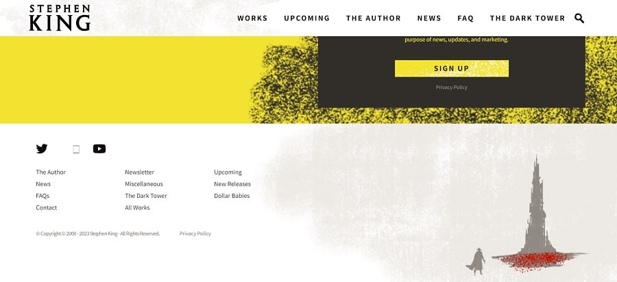
Author Stephen King is a brand unto himself. Author pages can be good website navigation examples because the topic is very focused on books rather than multiple product categories. If you run a niche business, you might appreciate the footer on this site.
Note how the categories are extended at the bottom but key ones stay in place, such as New Releases and Upcoming. You’ll also see the latest news and a link to details about the author. The footer is an excellent place to include links to social media.
Becoming a Website Navigation Example
Implement some of these techniques into your own navigational structure. One day, you might become part of a list of website navigation examples. With a little work, understanding your audience and consistent testing, your site will stand out from the competition and you’ll convert visitors into customers.
About The Author

Eleanor Hecks is the Editor-in-Chief of Designerly Magazine, an online publication dedicated to providing in-depth content from the design and marketing industries. When she's not designing or writing code, you can find her re-reading the Harry Potter series, burning calories at a local Zumba class, or hanging out with her dogs, Bear and Lucy.